
FTP Study
FTP20 Study Basics – From Torque And Angle To Peanut Plot
A few weeks ago – we dived into the cadence and power relationship in the FTP20 tests that participants have been uploading recently (Click here to read it). We were searching for recurring patterns to find a correlation between power output and cadence to ideally find the best cadence for the optimal power output in the FTP20 ride.
We will revisit the question in the future when we have more diverse data to find that specific relation – if there is.
This week we explore the peanut plot and how it should be understood and calculated from the torque and angle.
Now, what is torque?
Torque can be described as the force in rotational motion in the centre of rotation. When you kick the pedals, you apply force to the crank arm which twists the crankset and therefore makes it rotate around its own axis. This information is key for many power meter related analytics. One thing is the peanut plot, which many of you most likely have seen by now.
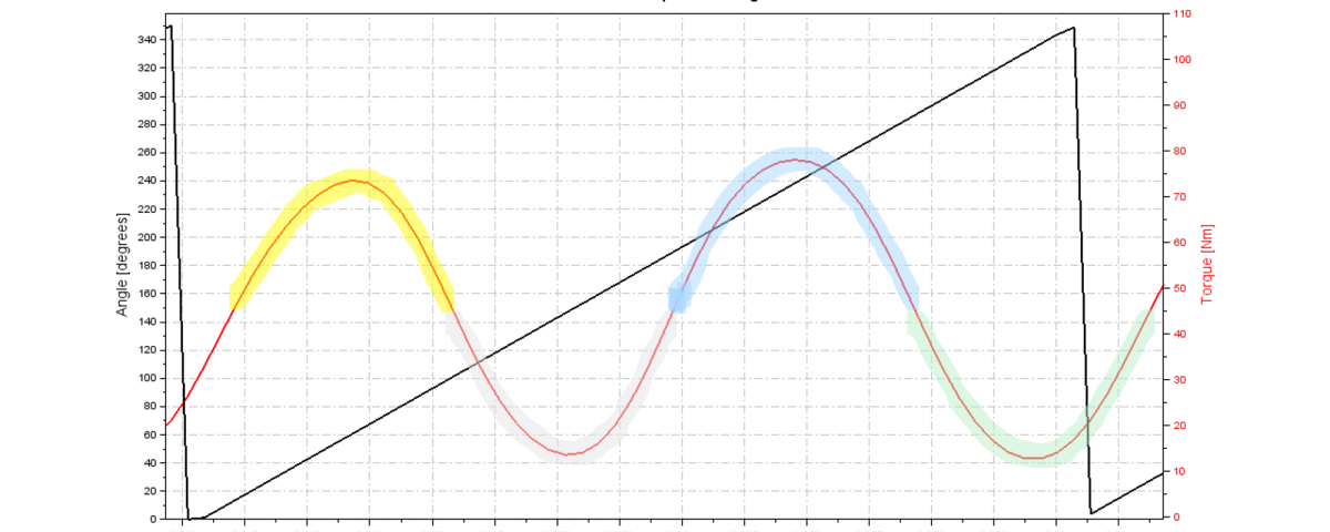
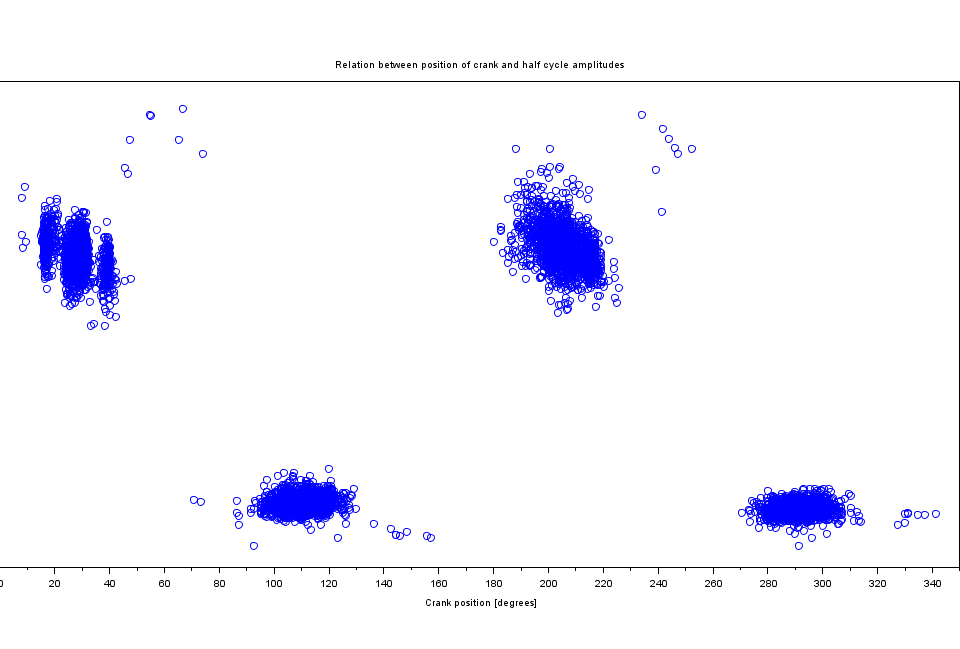
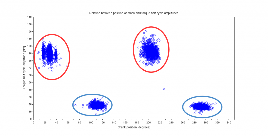
Now let’s look at the data. The peanut is the representation of the torque vs angle in a polar plot so the further away the line is from the centre of the circle, the more torque was applied to the corresponding angle. But to understand the angle hell, we decided to start with the torque vs angle in a two-dimensional Euclidean plane (coordinate system on a plane).
The plot consists of both angle (the black line) and the torque (the red line) over time. See below:
TORQUE ANGLE PLOT
The angle is accumulative to 360° so we know when a rotation occurs and can visualize the torque in a circle (which it already is from the start looking at the crankset on the bicycle).
We can see that the two peaks (highlighted yellow and blue) is where the left and right leg kicks and pull most efficiently. The angle can show us which leg is which. The same logic is applied to the “dips” (grey and green colours).
This way we can (very roughly) indicate 4 zones on the graph shown as 4 colours on the torque graph. The “peaks” (highlighted yellow and blue) are the maximum torque applied to crank which is in relation to the kick from both left and right leg. The “dips” (highlighted grey and green) are the minimum torque applied to the crank which is in relation to the compensation the pulls and pushes horizontally (pull backwards and kick forward) from both left and right leg. At this angle, it’s easiest to pull which is therefore what applies the most force.
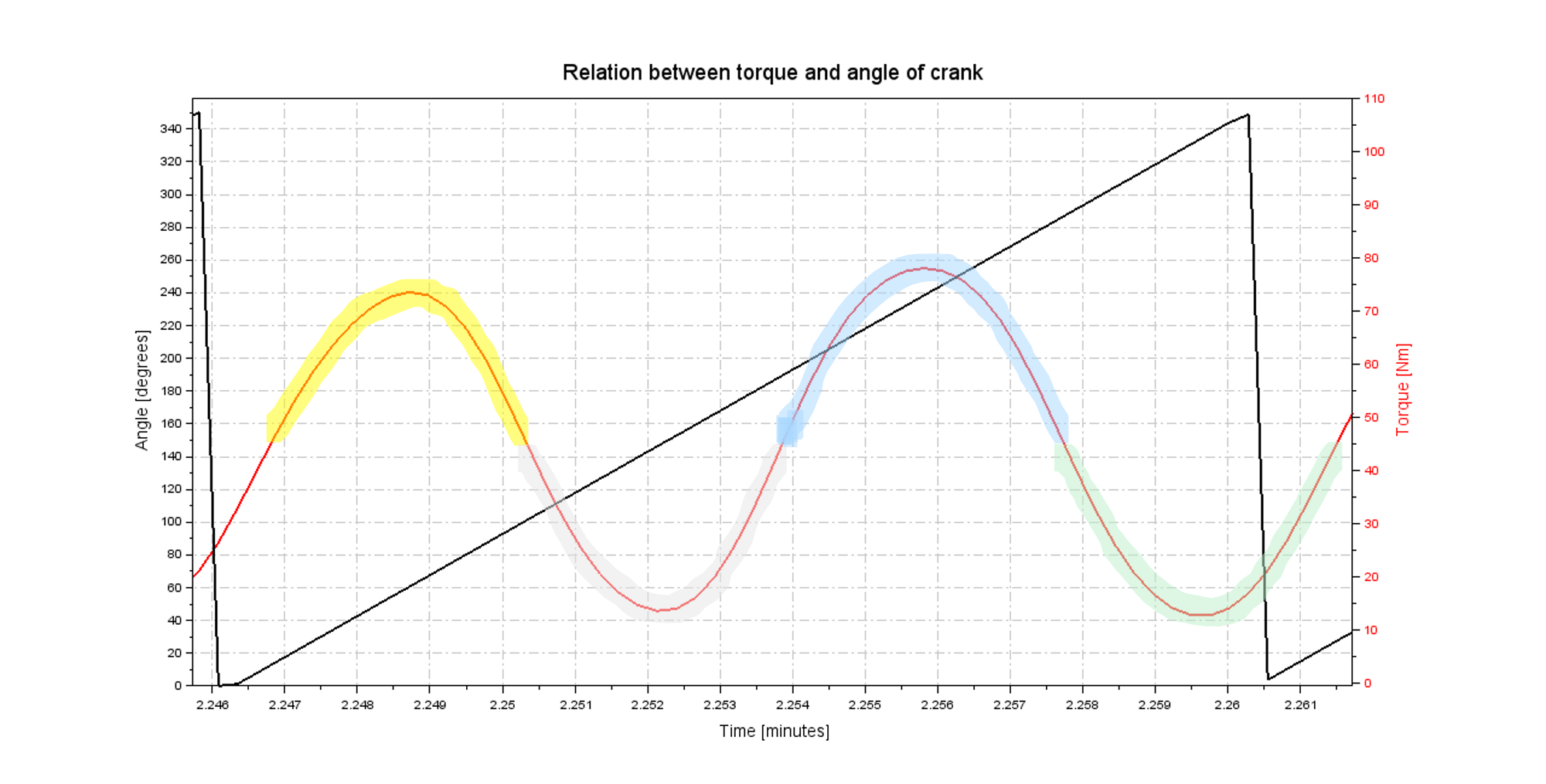
We have colourized the same zones in the peanut plot below.

On the peanut plot, we want to look at the two half rotations for the left and right leg. At top 0°, the right crank arm is pointing rotating clockwise. And at bottom 0° the left crank is pointing up and rotates clockwise.
This way it’s easy to visualize your general efficiency when riding your bike and look for abnormalities in your pedalling. Read our guide pedalling technique.
SHARE


READ ON!
Related Articles
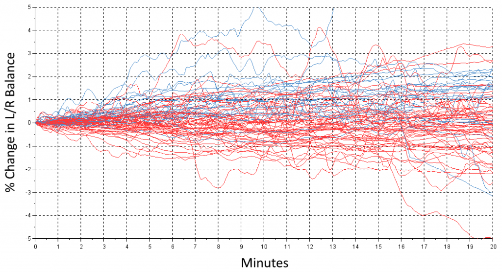
What happens when you get tired?
Today, we take a look at what happens with the left/right balance during those hard 20 minutes. You all start out at some level – we […]
FTP20 Study Basics – Torque analysis p.2.
Understanding the torque zones and the outcome thereof. In the previous blog’s torque analysis we saw the division of the minimum and maximum torque and how they […]
FTP20 Study Basics – Torque analysis
Understanding the detection of active zones and extremes. This time we drive further down the road of understanding of the pedalled data and show you what […]