
Training
What is the best way to visualize cycling dynamics?
Improving pedaling technique to get more power output with less fatigue is a goal for many bike riders and for obvious reasons. This may be one of those smaller things that can truly make a difference. As with everything in this age, to improve something it helps if it can be measured and compared over time. Same with pedaling technique, which is part of the cycling dynamics and physiological measurements used by bike riders.
Cycling dynamics
In short, cycling dynamics refers to a number of metrics designed to give a comprehensive insight into how you’re riding and how your performance changes based on variables such as position, bike setup, ride duration and more. Using these cycling dynamics metrics – riders, coaches, bike fitters and physical therapists can analyze individual data in order to improve and learn.
A crank based bike power meter can measure a lot of things, but in order to make it really useful, we need a good way to visualize it. Actually, this challenge is still not solved to any significant level. We ask for your input here. Read on – and enjoy a rare long-read.
Team ZWATT uploaders
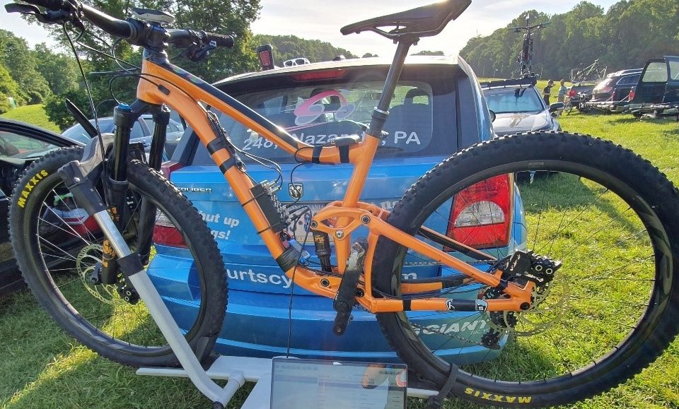
The full-fledged Team ZWATT members are using the power meter on their bike for all their training and are even contributing some of their ride data to a massive database of cycling dynamics. This database provides valuable data used to improve algorithms and test new firmware on real-world data before it is released. In this way, Team ZWATT power meter users help improve their own power meter.
The peanut plot
One way of showing a cycling dynamics metric that can be used to improve pedaling technique is what we internally call the “peanut plot” in lack of a better name. This shows the torque provided on the crank as a function of the angle. Engineers call this a polar plot. Now the big challenge with this is how to make it useful for actually improving your training?
This calls for some easy to understand visualization.
We are 100% sure this can be done in a better way. So we started to experiment and quickly found that we need the crowd to help un on this. So our challenge to you is: Do this in a much better way! We will even give you data to play with if you want at the end of this.
Examples from the net
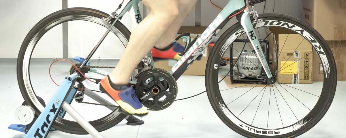
Let’s start with some examples from the net. First our friend Aart, who did some plotting of data from his training on the Wattbike. His plot shows the “peanut” nicely. Pure torque versus angle of the crank arms:
To read this plot, you need to understand how the angles work. This is Aarts description:
In the polar plot the angles are ‘reset’ when a crank is vertical to be able to compare angles during the downward phases of each crank (i.e. leg), therefore the angles in the polar plot correspond to:
- Top 0° left crank pointing upward, right crank pointing downward
- Left 90° left crank horizontal forward, right crank backward
- Bottom 0°right crank pointing upward, left crank pointing downward
- Right 90° right crank horizontal forward, left crank backward
- Top 0° identical to first 0°; left crank vertical pointing upward
As a completely different view, this is how it may look on a Garmin bike computer if your bike is fitted with their pedal-based power meter solution:

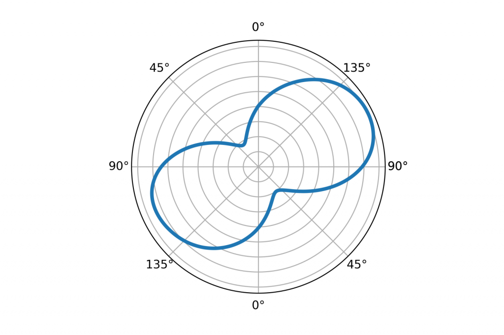
Our internal engineering tool
We have an internal tool to do this as well, that looks pretty engineering-like, but gives us great detail and ability to zoom in and look at any detail in the data. Here it is for completeness:
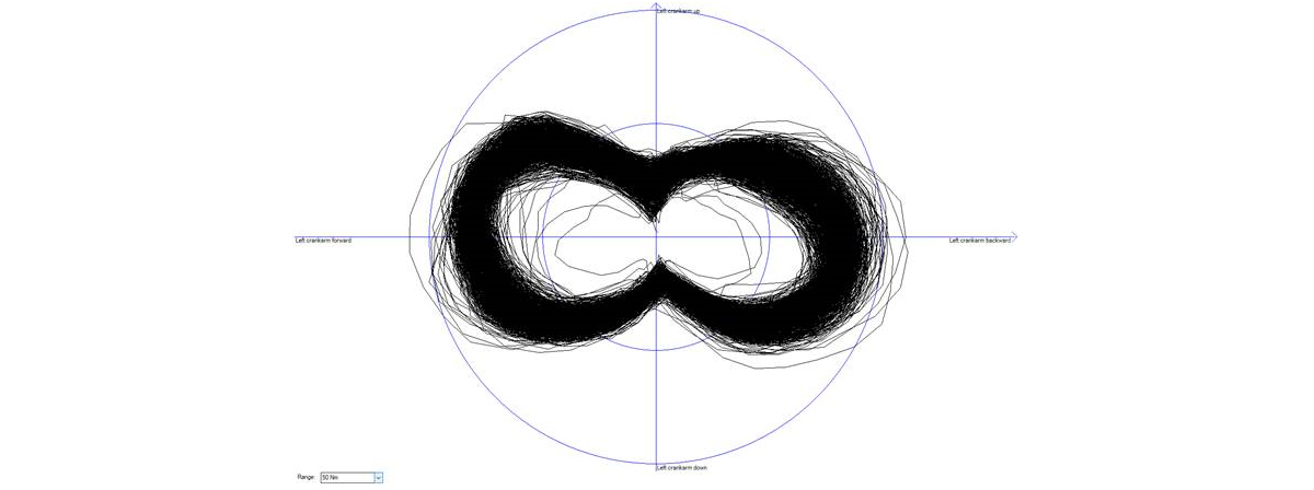
Yes, you were warned. This is from the internal engineering tool 🙂 This same tool also generates a video representation, that you can view here:
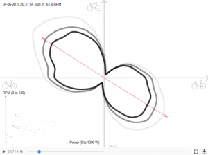
Click image to play video in a new tab/window.
The video requires a bit of an explanation:
The big black solid line shows your torque as your crank rotates.
The red arrows moving somewhat up and down indicate the angle where your maximum torque is. I’ve seen before that they shift when riders get tired, but yours seems stable from start to finish.
At the lower left, you find a cloud plot. Each dot represents an average of power and torque over ten seconds. It can show how your cadence and power is distributed. If your cadence is fairly constant the dots will make a fairly flat shape. If the power is kept constant, the dots will cluster around a vertical line.
Plain torque versus time plot
Another way to look at the data is a more traditional torque versus time plot. This is how that can look in our internal tool:
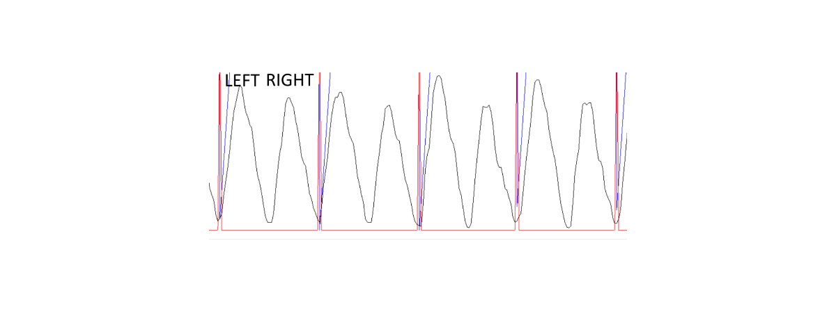
This user seems to have a bit of an imbalance between left and right leg, so this is what we wrote to him:
The black line is the torque you apply. The vertical red/blue lines indicate the point where the left crank arm is pointing upwards.
It looks like your left leg is pushing harder than your right leg. I see this pattern throughout the file when I look into various parts of your ride.
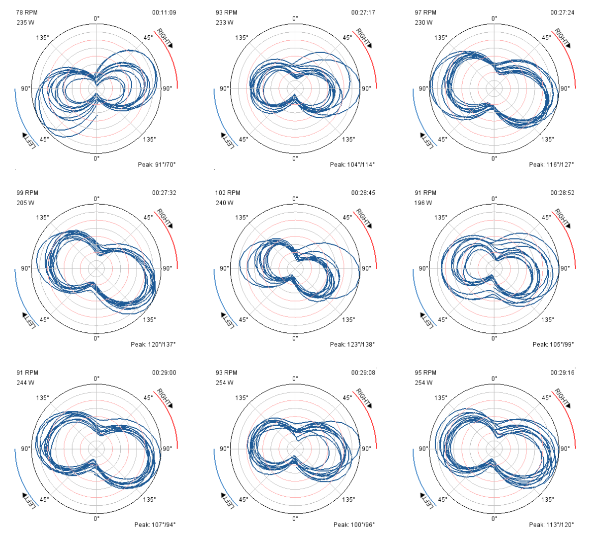
More polar plots
Getting back to the polar plot, we also did a tool to make 9 plots from various short sections of a ride. This is how that looks for this 30 min ride:
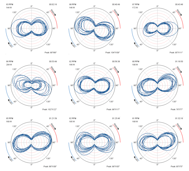
So one of the questions you may ask yourself is, how does a “normal” plot look like. The Wattbike guys have a great explanation on some of this. We did a small animated gif to show the spread across some recent uploads from the Team ZWATT uploaders:
Now is your turn… What would be a much more useful (and maybe also much more beautiful) way to show this type of data to help the rider improve pedaling technique?
Comments below – but even better: Get some sample data and create your own version. More about this below.
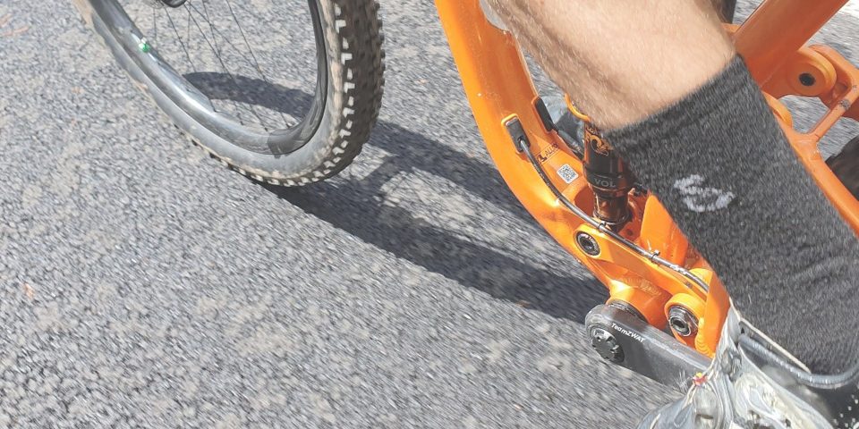
What raw data does a power meter provide?
Any crank-based power meter will measure the torque applied to the crank (Tq measured in Nm). It will also measure the angular velocity or cadence (often shown in RPM). The power sensor calculates power by multiplying these two values (P = Tq * w, with Tq in Nm and angular velocity w in rad/s).
Typically an accelerometer is used to measure the angular velocity (or cadence). This is the case for the Team ZWATT power meters as well. Cadence is calculated by looking at how earth gravity pulls in the test mass of the rotating accelerometer. The output of the accelerometer is in the form of X and Y axis acceleration. This will look like sin(w*t) and cos(w*t) when the accelerometer rotates. And then add a lot of noise on top of this due to vibrations and the actual acceleration of the bike in all directions.
A dataset to play with
Here is a dataset from a real ride done by one of the Team ZWATT uploaders. It contains some of this raw information and also some pre-calculated values to make things easier to work with. This is the columns in the dataset:
n – The line number (also sample number)
t [s] – Time of this sample in seconds
x [g] – Raw accelerometer output in the X-direction measured in g’s (expect a lot of noise)
y [g] – Raw accelerometer output in the Y-direction measured in g’s (expect a lot of noise here as well)
P [w] – Calculated power in watts. This value has a slight delay and is only updated once per half rotation.
Tq [Nm] – Raw torque measured in Nm (newton-meter)
ω'[RPM] – Calculated angular velocity in RPM (rotations per minute). This value has a slight delay and is only updated once per half rotation.
α[°] – Crank angle in degrees as per the definition: 0° corresponds to left crank (non-drive side) arm pointing up – and – 90° corresponds to left crank pointing forward. When working with the angle, we recommend you unwrap it first to make it monotonic and then do a running average on this to smooth it out a bit.
Lattitude[°] – Don’t use this
Longtitude[°] – Don’t use this
The file is a simple tab separated text file, which should be relatively easy to work with. We love using Scilab and Excel. You will surely have other preferences. Due to some setteling effects of the algorithms, skipping the first 20 rotations of the crank is recommended for best restults.
Let us know your comments with #teamzwatt – And don’t forget to include links to your ideal cycling dynamics visualizations.
SHARE


READ ON!
Related Articles
Guest post: Training is more than just averages
I am often asked what the most important aspects of performance data are for MTB racing and training. My answer is always, “all of it.” Back […]
Guest post: Why nobody spends on MTB power meters?
During the last several weeks, I’ve been to a ton of races in North America. It’s winter now in New Zealand, so I took one of […]
Guest post: ÿding, first impressions
We have sent one ÿding power meter to our good friend Matt Miller – who is the worlds first PhD in mountain biking – to share his […]